About the Client
Medestetica is a leading medical aesthetics clinic offering a range of transformative surgical and non-surgical procedures. With a reputation built on results and patient trust, the clinic sought a visual identity that reflected both its medical precision and its dedication to personal transformation.
The Design Concept
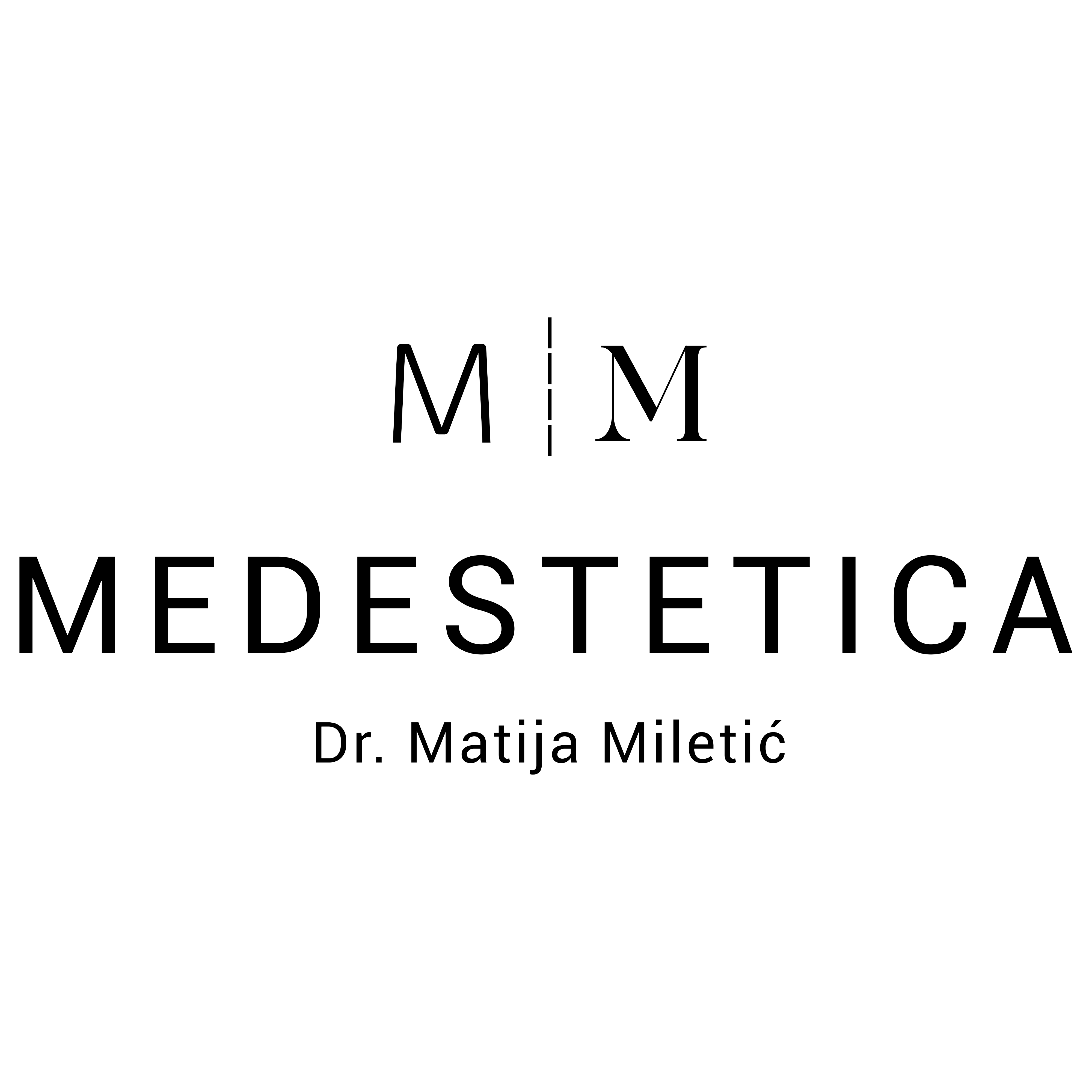
The new logo centres on the M|M monogram — a deceptively simple mark that carries deep meaning. The two letters represent a patient's journey: the left M symbolises the patient before the procedure, and the right M represents the patient after. Between them, the vertical line is not merely a divider — it references the precise incision line used in surgery, a subtle nod to the clinical mastery at the heart of the brand.
The result is a logo that communicates transformation, balance, and professionalism without relying on clichéd medical symbolism. Every element earns its place.
From Old to New
The redesign marked a significant step forward in Medestetica's brand positioning — moving from a generic aesthetic to a distinctive identity that stands out in the crowded medical aesthetics market and reinforces the clinic's premium positioning.